Multiselect Combobox
Mger Ktoian
Usage
Add the component to your template and pass the available options plus the currently selected values:
<c-multiselect-combobox
	label="Select Fruits"
	placeholder="Choose fruits..."
	options={fruitOptions}
	value={selectedFruits}
	onchange={handleSelectionChange}
></c-multiselect-combobox>
fruitOptions = [
	{ label: 'Apple', value: 'apple' },
	{ label: 'Banana', value: 'banana' },
	{ label: 'Cherry', value: 'cherry' }
];

handleSelectionChange(event) {
	this.selectedFruits = event.detail.value;
}
Properties
| Name | required? | type | Description/Example |
|---|---|---|---|
label | optional | String | Field label shown above the combobox. |
placeholder | optional | String | Text shown when no value is selected. Defaults to "Select Options". |
options | required | Array of objects | Available options, e.g. [{ label: 'Apple', value: 'apple' }]. |
value | optional | Array of strings | Selected option values, e.g. ['apple', 'banana']. |
disabled | optional | Boolean | Disables interaction and greys out the field when set to true. |
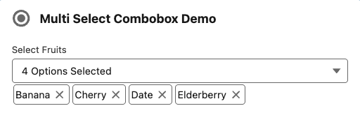
hidePills | optional | Boolean | Hides the selected-value pills below the combobox when set to true. |
Events
| Name | Description/Example |
|---|---|
change | Fired whenever selection changes. event.detail.value contains the value array. |
Demo
See sampleMultiselectCombobox for a full working example that shows selected values and demonstrates handling the change event.